

Here at Business Tech Ninjas, we have the privilege to work with lots of really kick-ass businesses with amazing content. A large portion of our clients are businesses already knee deep in their membership site journey – they have members, they have content, they have a site that does an okay job, but they aren’t sure what’s next. That’s where we come in.
One thing we see all the time, is a site with fantastic content but problems figuring out how best to deliver or lay out that content so that it is easy to navigate. If your members can’t find your content, no matter how great it is, they can’t consume it.
One of the big values of working with an outside provider is that we come in with fresh eyes to your site like a new member, and immediately see what is confusing or unclear. One of the big values of working with Business Tech Ninjas, is we can combine those observations with our expertise to give you our professional opinion of how to transform your site into your site but better – think of us as the 80s movie makeover montage, and your site needs to get ready for the prom.
One of our recent clients came to us with these exact issues, their site was in need of a facelift. Visually, it was a little dated, but more importantly it was confusing – for them and their users!
They forwarded a few member emails to show us what type of comments they typically got from new members. This is real feedback from a member:
I did login last night and got way overwhelmed. I’m not sure where to start. Am I missing something actually called “boot camp”? There were so many things that peaked my interest and I started browsing through and WOW, I just didn’t know where to begin. Is there an order if which I should begin? I’m thinking there should be basics I should start with…???
And it’s no wonder! All their valuable content was hidden away. At first glance, you’d would never have known that their site had nearly a decade’s worth of resources and information!
They had identified several key problems with their site:
- Their users were overwhelmed with the amount of content
- Resources & Materials were hard to find
- Support requirements & manual client updates were taking up all of their admin’s time
- They didn’t know how to use their site!
And on top of that, they had identified that their site needed a visual refresh, and they wanted to change how their content was being delivered. It was a great opportunity to hit refresh and build up a new site from scratch. This gave us the opportunity to really think out what we were doing, clear out fourty three (fourty three!) “active” plugins and set them up for the next phase of their scaling process.
We proceeded with the following goals:
- The most important content needs to be front and center – in this case, the three courses that made up the core offerings
- Resources & tools need to be filterable & searchable
- Members should be able to see the clear “success path” as soon as they log in
- Automate processes to take some of the load off of their admin team
- Make the site easy to update and maintain (even for an admin that has never used WordPress)
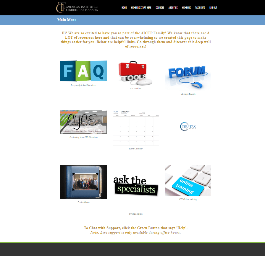
User Dashboard
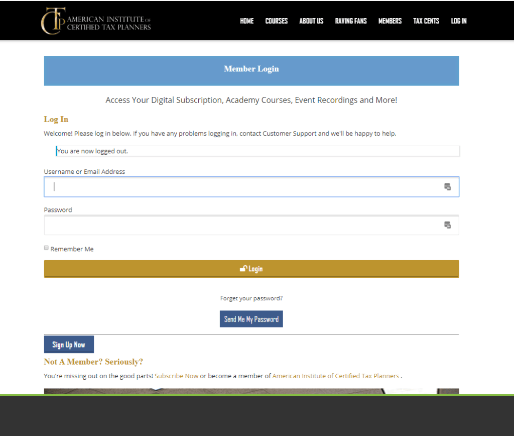
The Before
Probably the most dramatic change to the site, is the dashboard and course delivery process. Below, I’ve included a before picture of the dashboard that members were greeted with. As you can see there are a lot of great resources highlighted on this page – but there’s a lot of room for improvement. Even without knowing what this site does, it’s probably obvious that there isn’t a lot of visual consistency with the icons. Although this may seem like small potatoes to you, consistency with colours, fonts and icons, can really improve not only the user experience of your site, but also your brand identity and recognition.
The bigger issue however, is that the core offering of the site – the courses that you must complete to get certified – are nowhere to be found. The initial email that goes out to new members highlights how they should get started with the first course, but to find it members need to navigate into the “courses” menu item and then search for it in a drop down with several other options.
The After
When they came to us to start this project, the client mentioned wanting to control the flow of members through their course materials in a more logical way. They had two streams of people, the bulk of their users who would attend an in person live event, and a smaller group who would take the online course material only.
Live Event attendees sign up for an event date and they immediately get access to their intro materials. The other two courses are locked down for now, as they are the event review and the event follow up. Once the event date passes for a user, they are granted access to their course review and follow up sessions.
Online Only members are entered into the system the same way – with access to only the intro course. The difference is, they are not dependent on an event date. Once they are finished the first course they are granted access to the second course, etc.
All users have access to the resources and tools at the bottom portion of the dashboard.
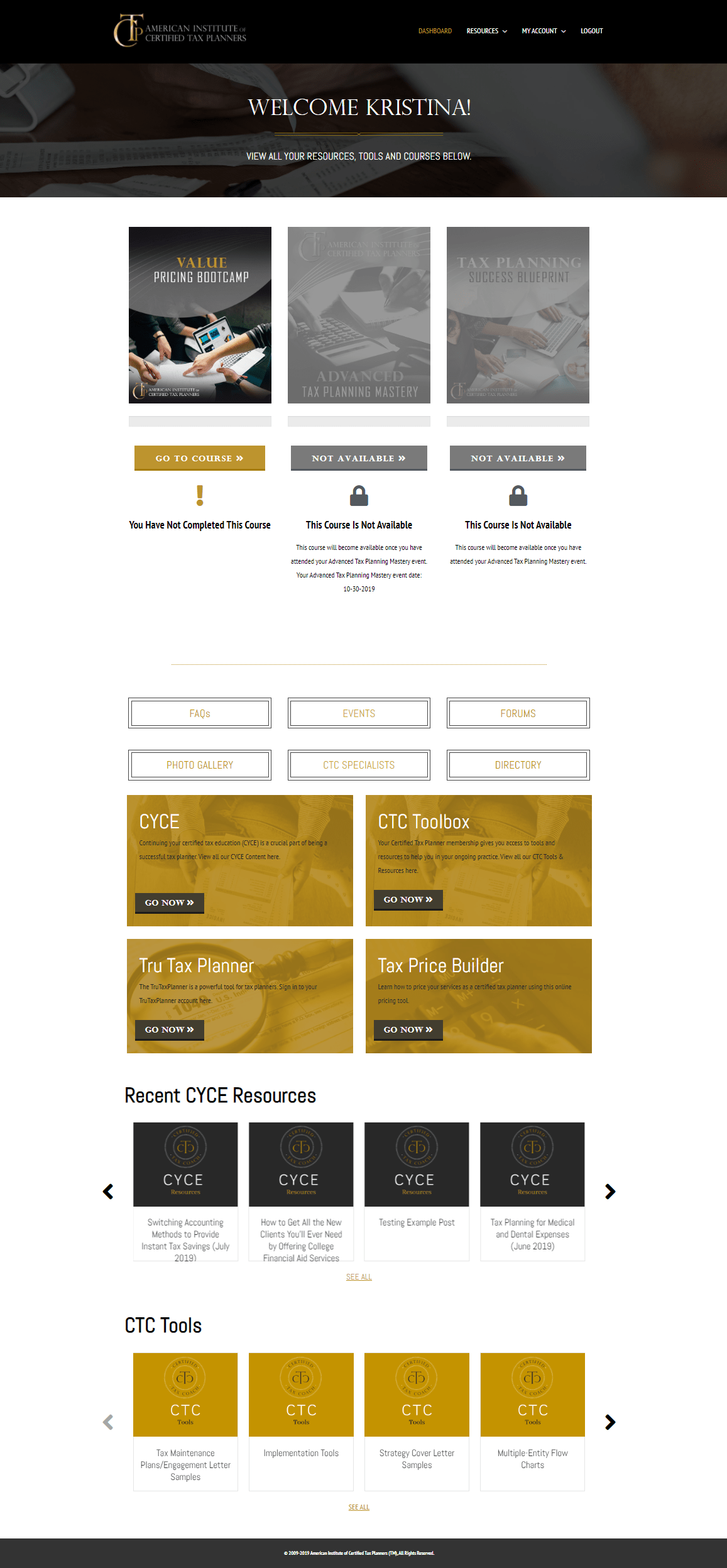
As you can see in the screenshot above, the dashboard displays where a user is in the course progression. The dashboard will update to show locked/unlocked, as well as completed/not completed.
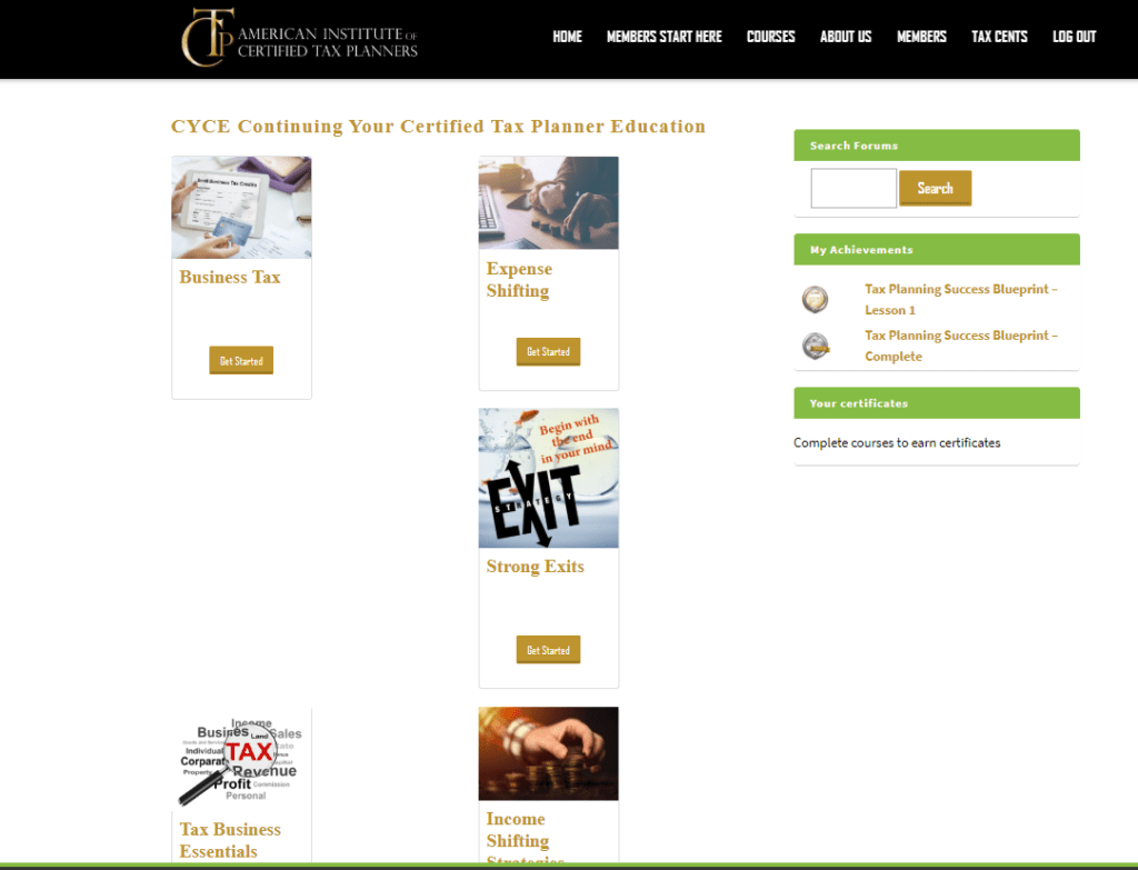
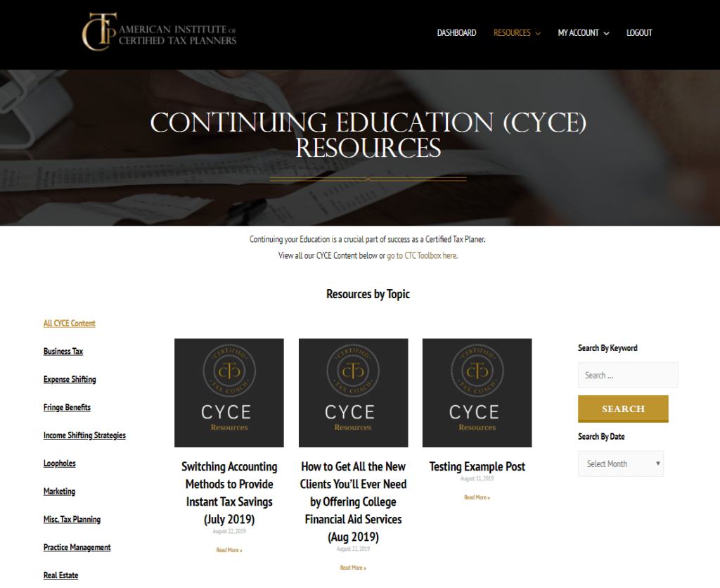
Toolbox & Resources
One other large issue with this site, was that the 10 years worth of materials they had were all trapped in Learndash courses and weren’t easy to search, display or use. While Learndash is fantastic – it’s not the best place for things like marketing templates, business card downloads, and other items that aren’t really course material. We updated their resource and toolbox materials to posts, so that the information was easy to find, dynamic and filterable! See the difference below:
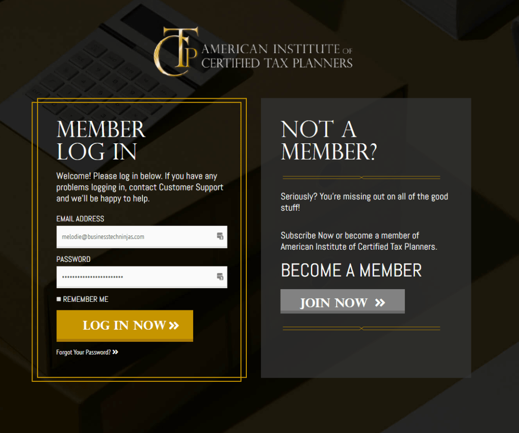
Login Page
One crucial element for a membership site, that often gets overlooked, is a login page. Since most membership sites live on a subdomain of a main site, often the first thing your users see when they go to your site, is the login page. You wouldn’t create a Facebook ad campaign that leads to a landing page you hadn’t thought out, so why would you let the first page many members see once they’ve opted in (or given you their money!) be boring – or worse, the /wp-admin screen.
The login page is a great chance to start building credibility and reinforce your brand to your new members. A sleek login page with a little bit of “wow” really goes a long way to making your site look like you really know what you’re doing.
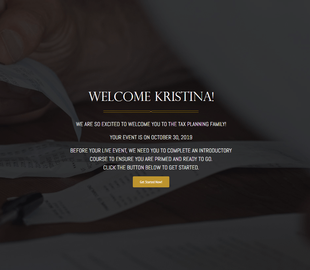
Welcome Page
If you use autologin links in your welcome emails, the welcome page is the first page your new members see – so it’s important they know they’re in the right place. It’s also a great place to prime your users for what’s coming next – in this case, the first lesson of the first course that they have to complete to make it through the certification process.
Wrap Up
So as you can see time can make a mess out of even the best laid plans (and membership sites.) If you are thinking about a rebuild, consider carefully the pros and cons of building on top of what you already have or starting fresh. Sometimes a clean slate and a fresh pair of eyes can be the key to getting your site working harder for your members.
Do you have a site that could use a little Business Tech Ninjas magic? Contact us here.