Showcase
Membership sites is what we do. Below are just a few of the sites we have completed.
24toDouble Membership Site Rebuild

Before: The 24todouble.com membership site was on CustomerHub. They wanted to move because members found it difficult to find content. They had a lot of ideas on how to cross sell in the platform but it was difficult using CustomerHub. They wanted to have a welcome page that only showed up once and that page to be customized.
After: We are able to do all of the above and much more. We implemented 1-click upsells from within the site, which increased conversions and customer service inquires. All of their content now lives in one, easy to access site.
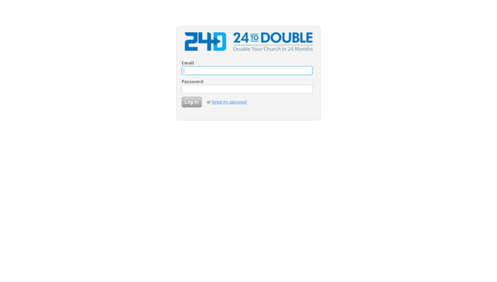
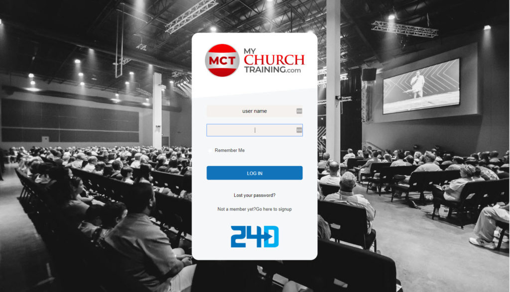
Above is the login screen before and after. We created a branded version, which demonstrated how professional the company is as well allows for people to click to join if they are not already.
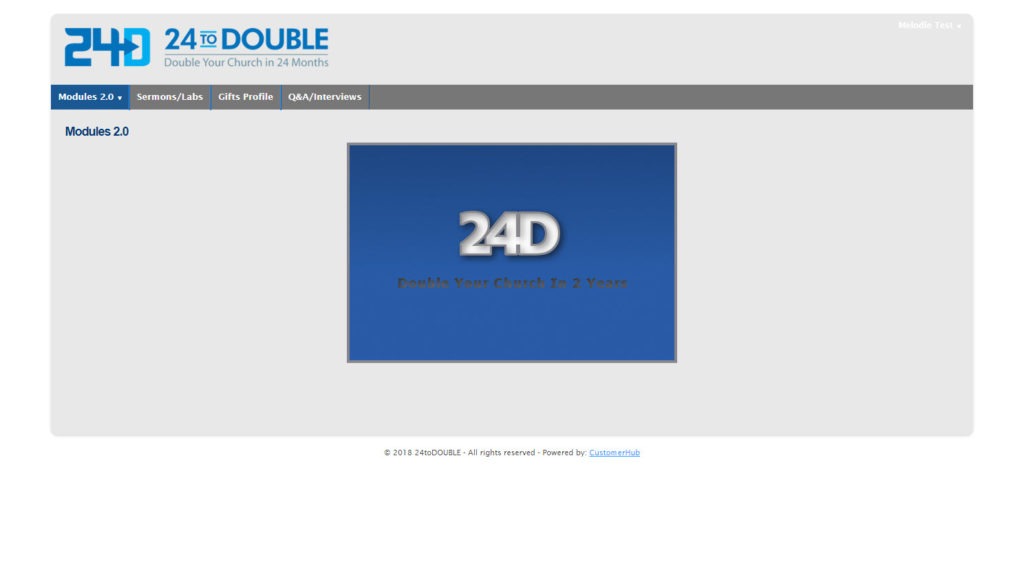
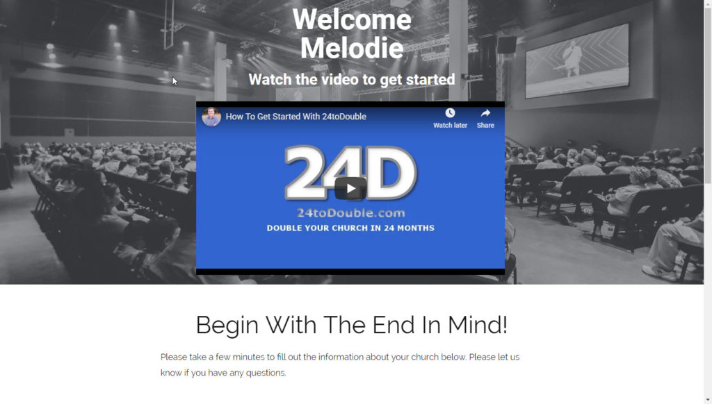
Above is the welcome page. This only appears once, the first time a member logs in. They have the client fill out a form to track their progress. Before, members would fill in a different email then was on their record. This was breaking this system and creating work for the CS team. We made it so their name and email is no longer editable, eliminating this problem.
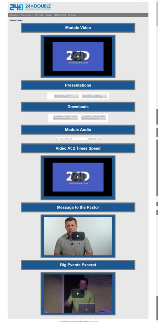
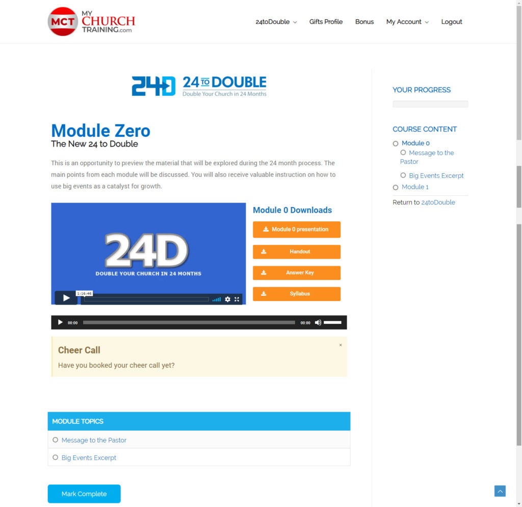
Above is one of the module pages. Before, all the content was on one big long page. This made is challenging to keep track of where a member was in the content. We put the content into Learndash and improved the overall UX.
