IAITAM: From “One Site Does Everything” to a Clean, Professional Marketing + Membership Experience
We redesigned the IAITAM web presence to match their global professionalism, streamline the purchase journey, and deliver a modern member portal experience—without compromising the content depth IAITAM is known for.
Before the Redesign
Outdated User Interface
Homepage and key pages didn’t reflect IAITAM’s professionalism and authority.
Content hierarchy made it harder to quickly understand offerings and next steps.
Overall brand presentation lacked polish and consistency.
Checkout Friction
The checkout process required many steps, creating unnecessary drop-off points.
Users had to work too hard to complete membership and program purchases.
Mixed Audiences in One Site
Marketing, sales, and member delivery were competing in the same navigation and structure.
Member access pathways weren’t as clear as they needed to be post-purchase.
Membership Site: delivery → access → retention, optimized for programs and certifications.
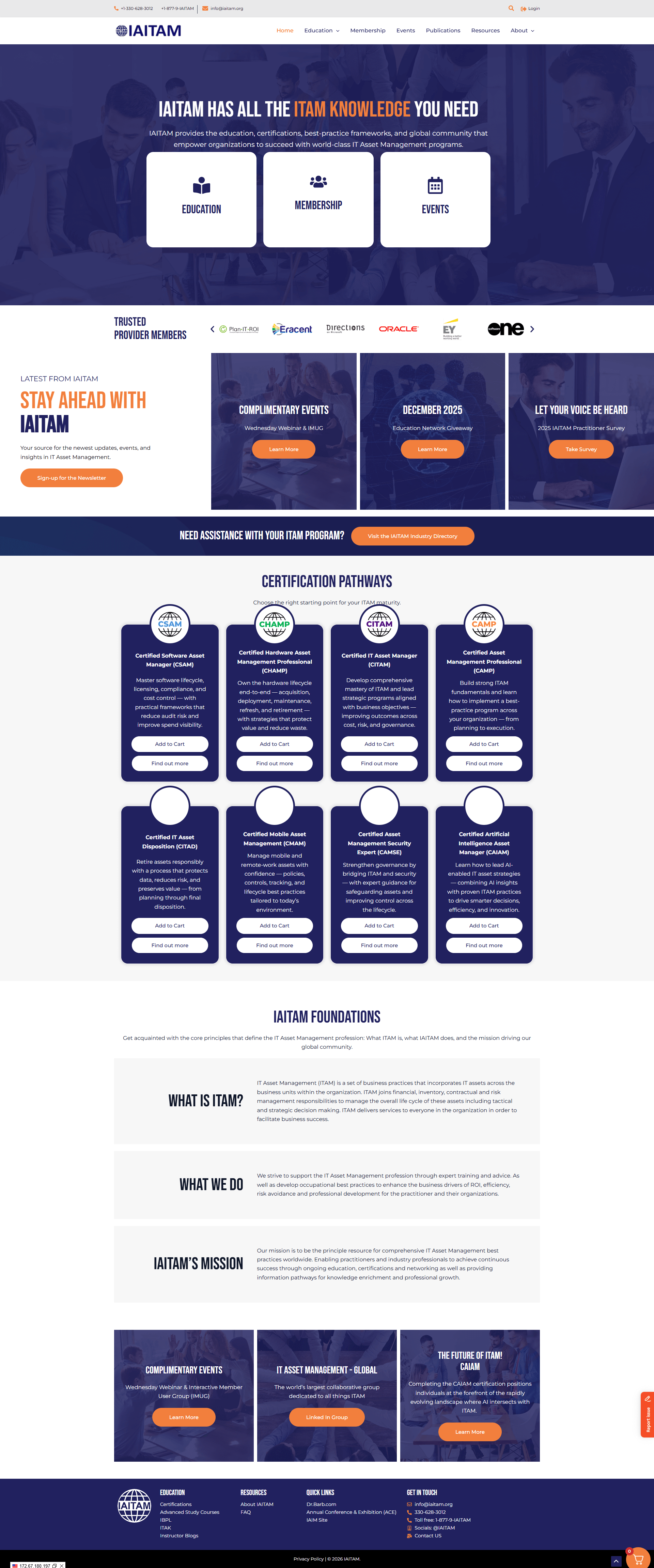
Homepage Glow Up + Professional Branding
Updated layout, typography, and visual hierarchy to match IAITAM’s authority.
Cleaner navigation and clearer calls-to-action for better decision-making.
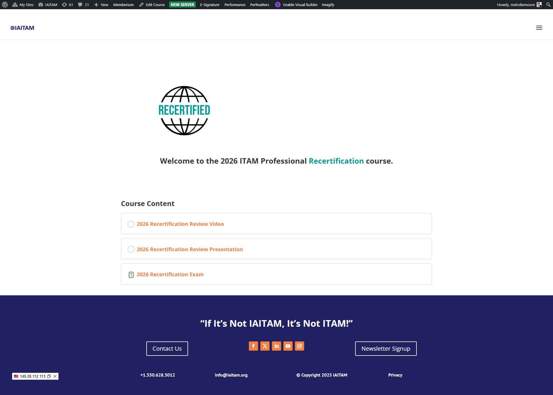
Improved Purchase + Member Experience
Simplified checkout flow (fewer steps, less friction).
More intuitive post-purchase journey for accessing member programs.
Dedicated Certifications experience inside the membership environment.
Key Improvements
Highlights that show off the scope and impact of the IAITAM transformation.
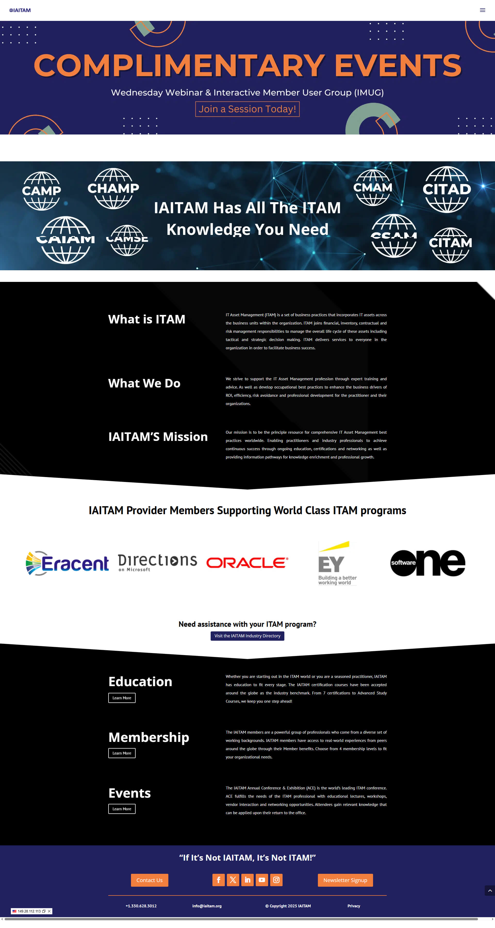
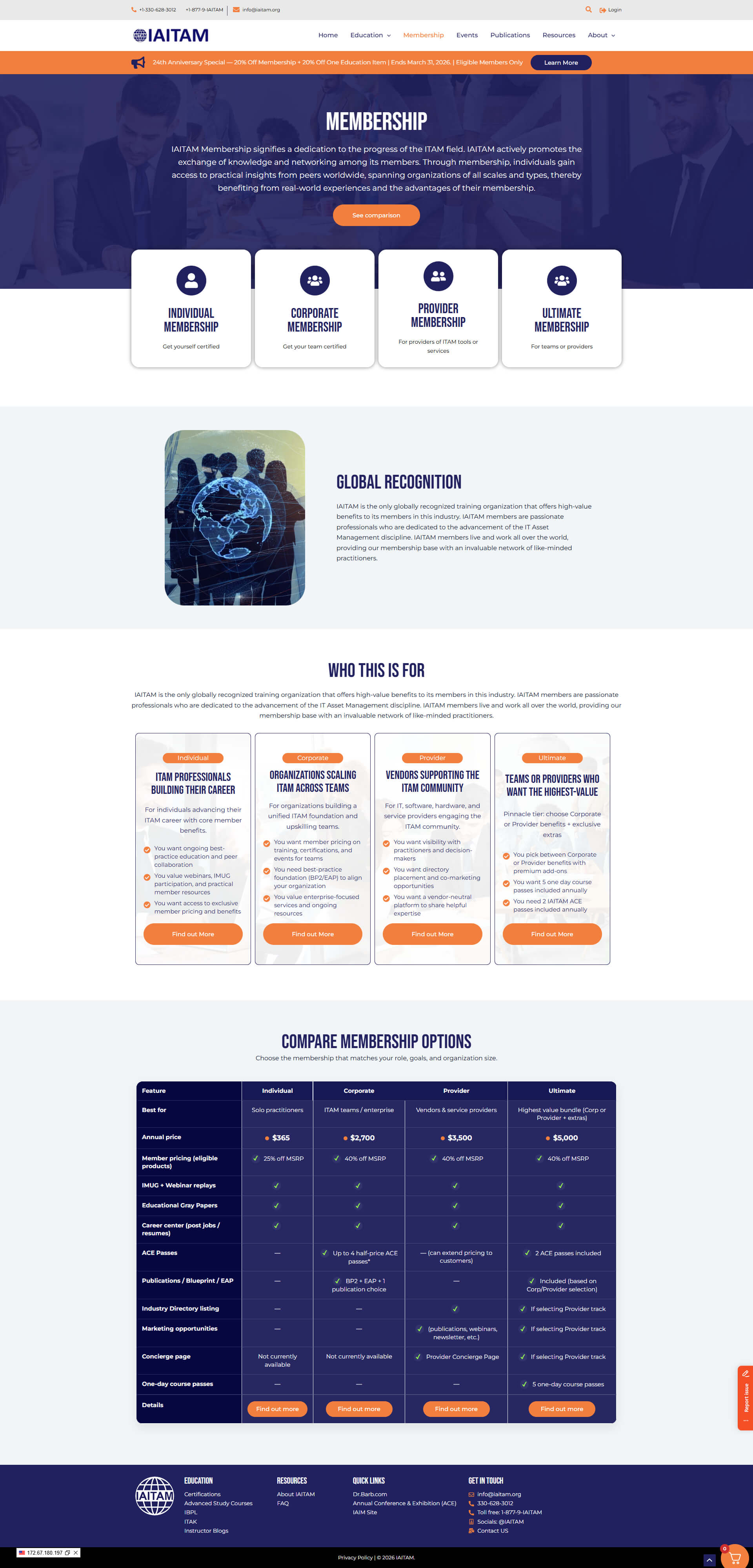
Homepage glow up + brand alignment
We modernized IAITAM’s public presence with improved spacing, typography, hierarchy, and a more polished visual system— aligning the brand with their credibility and professionalism.
Before
After
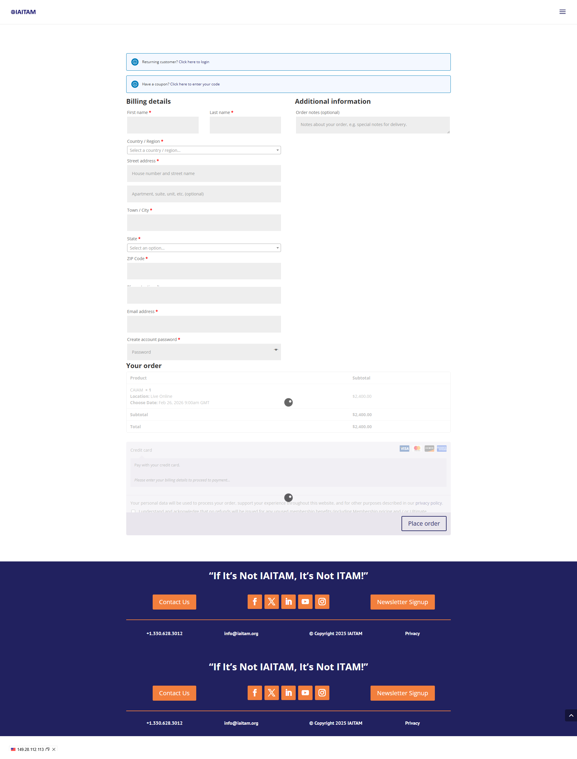
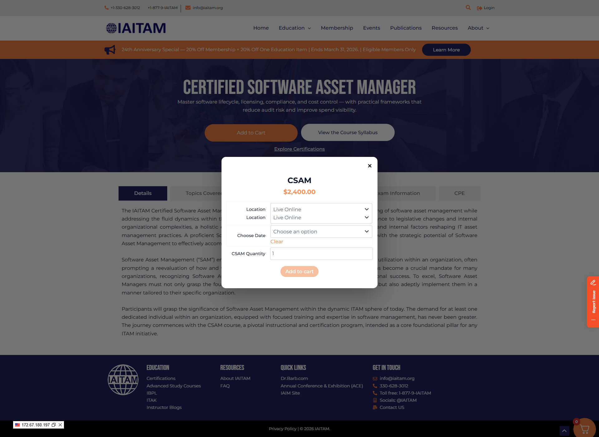
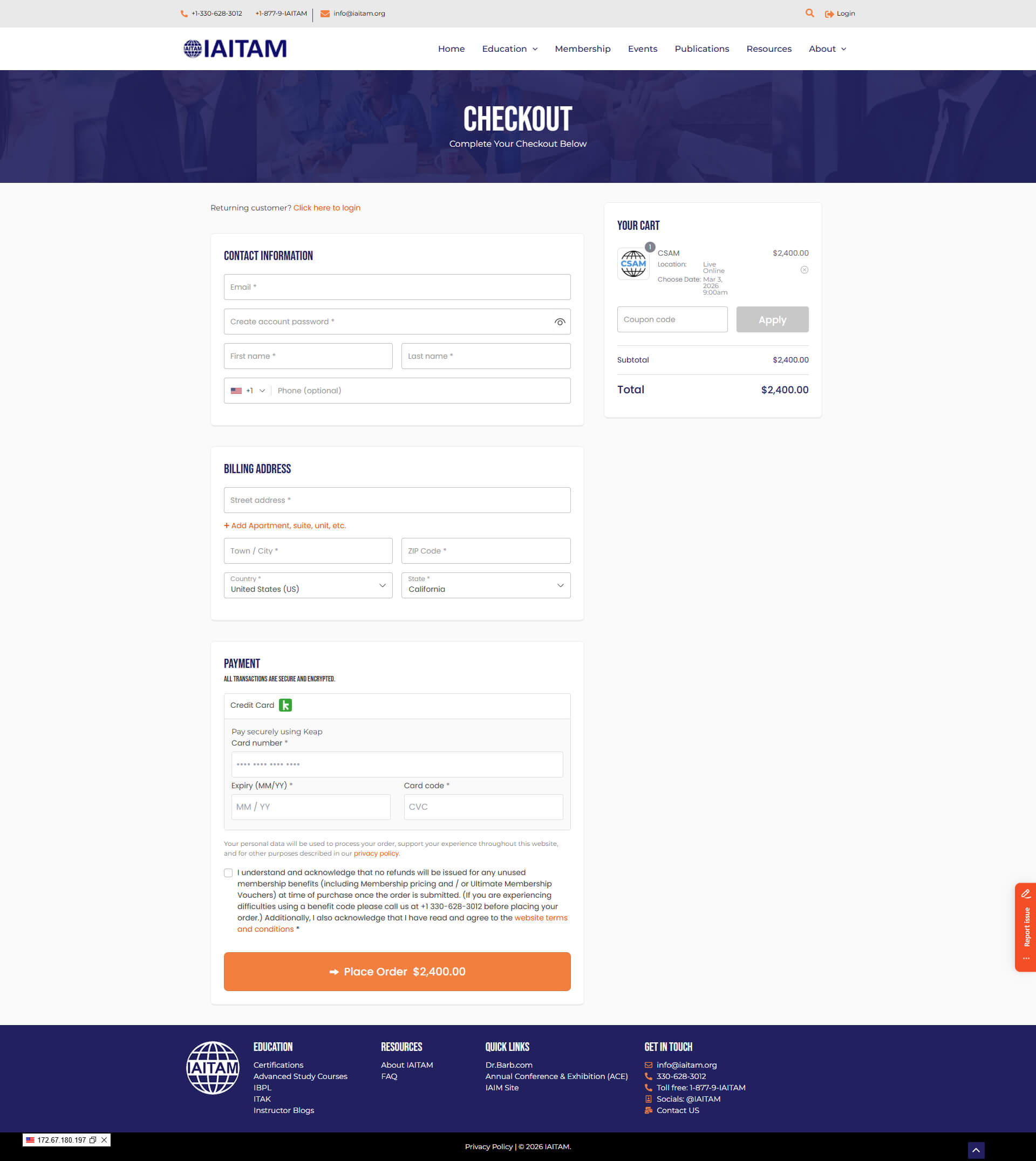
Checkout simplified (fewer steps, less drop-off)
The prior checkout journey required too many steps. We streamlined the experience so users move from intent → purchase with less friction and clearer guidance.
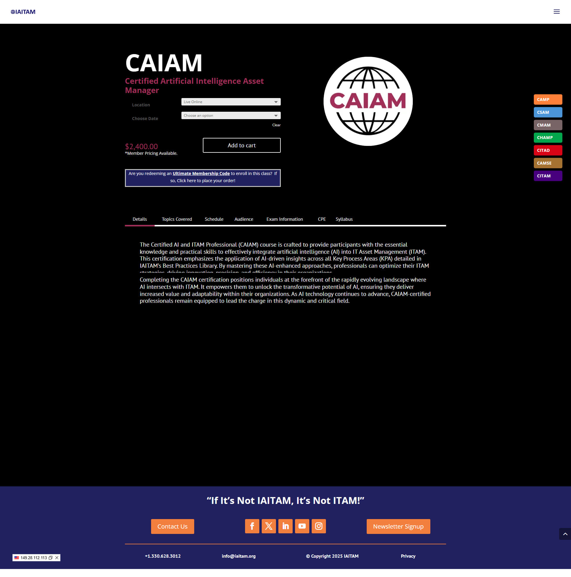
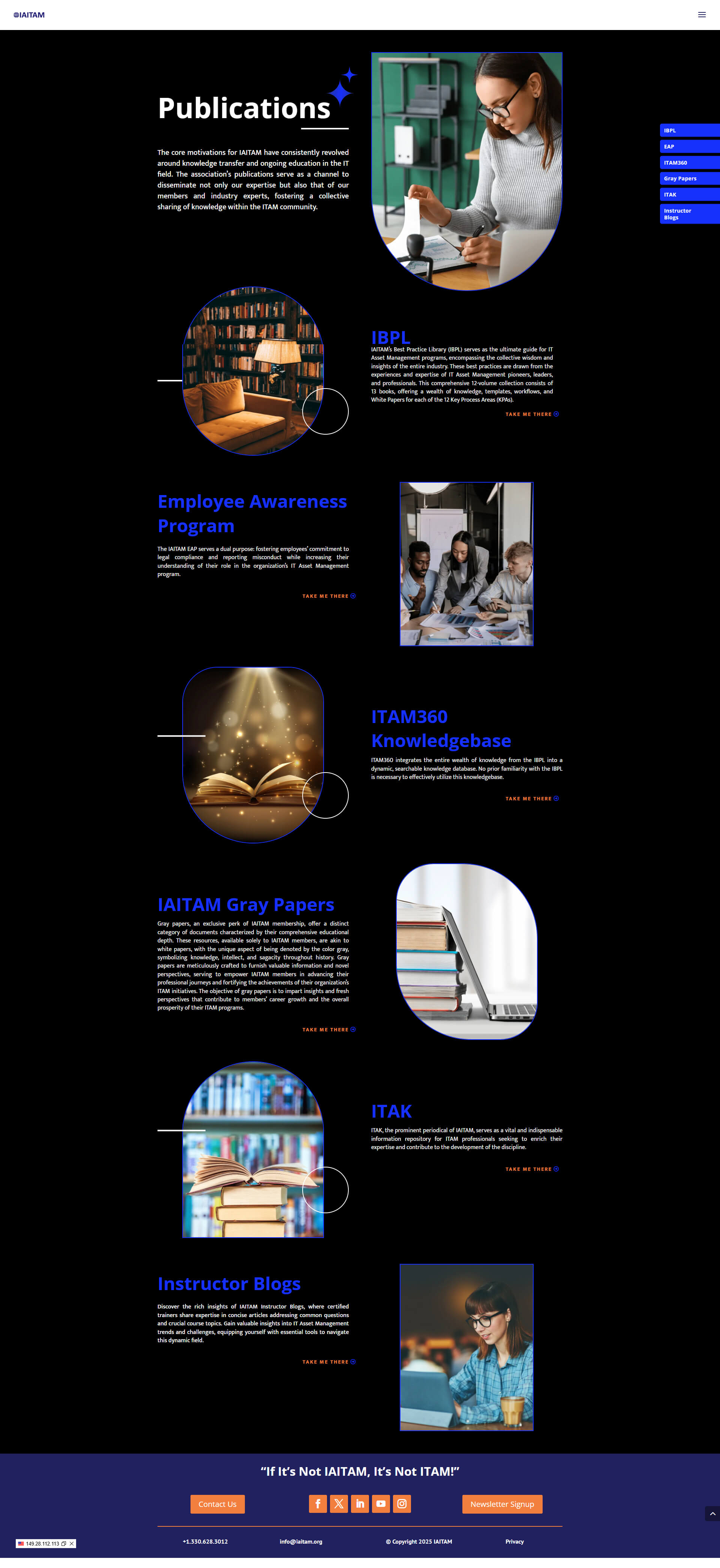
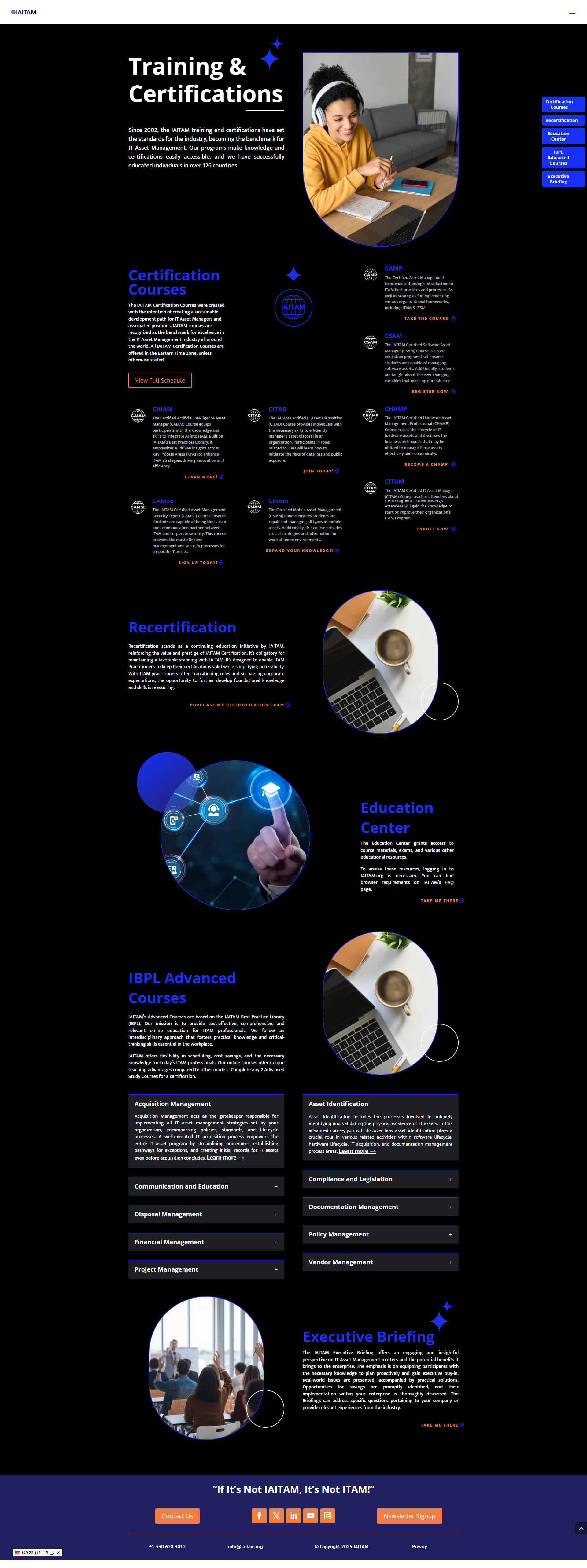
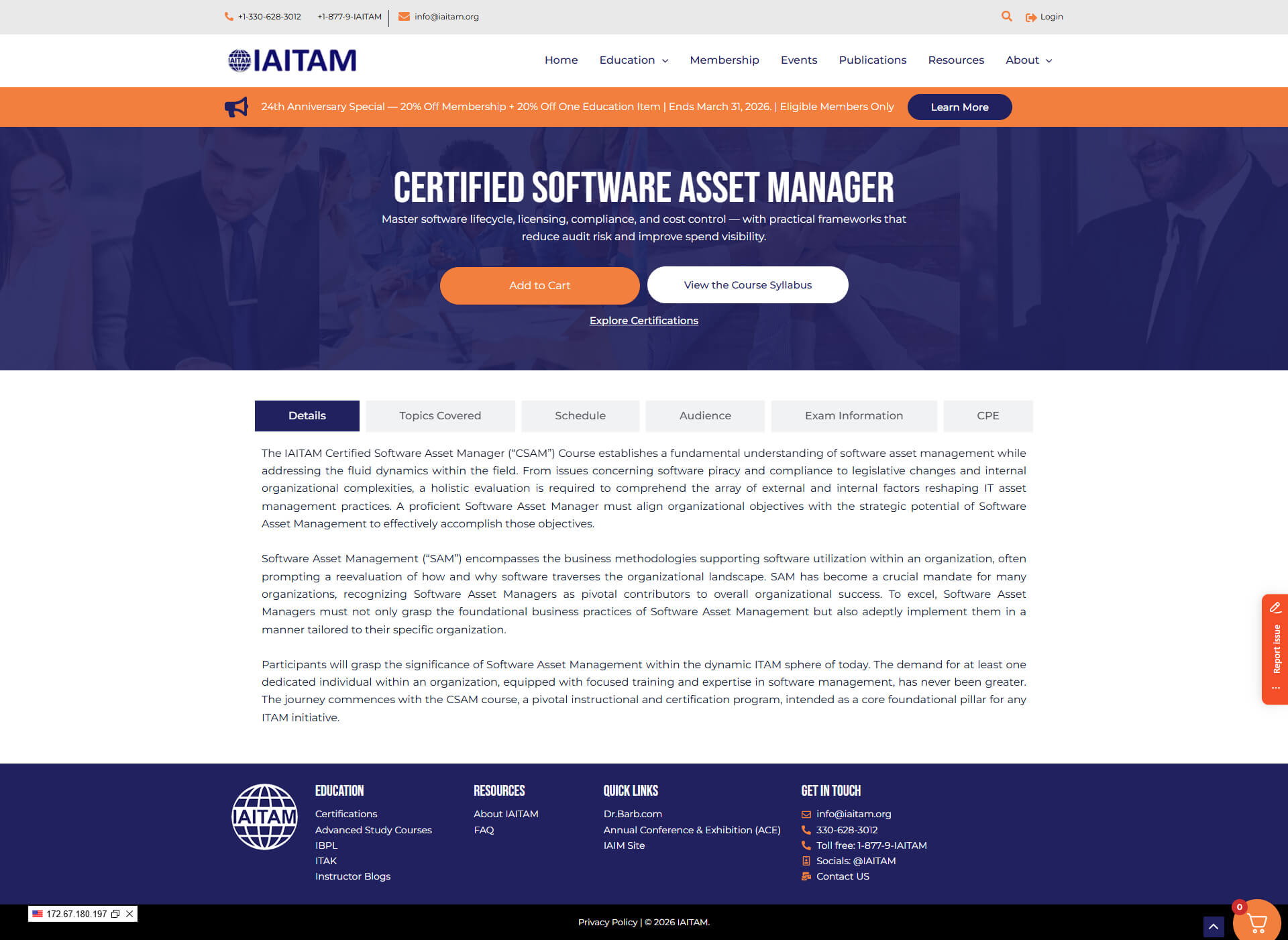
Better sales pages
We rebuilt key sales pages with clearer positioning, benefit-first structure, and more scannable sections— supporting conversion without sacrificing IAITAM’s depth of information.
Before
After
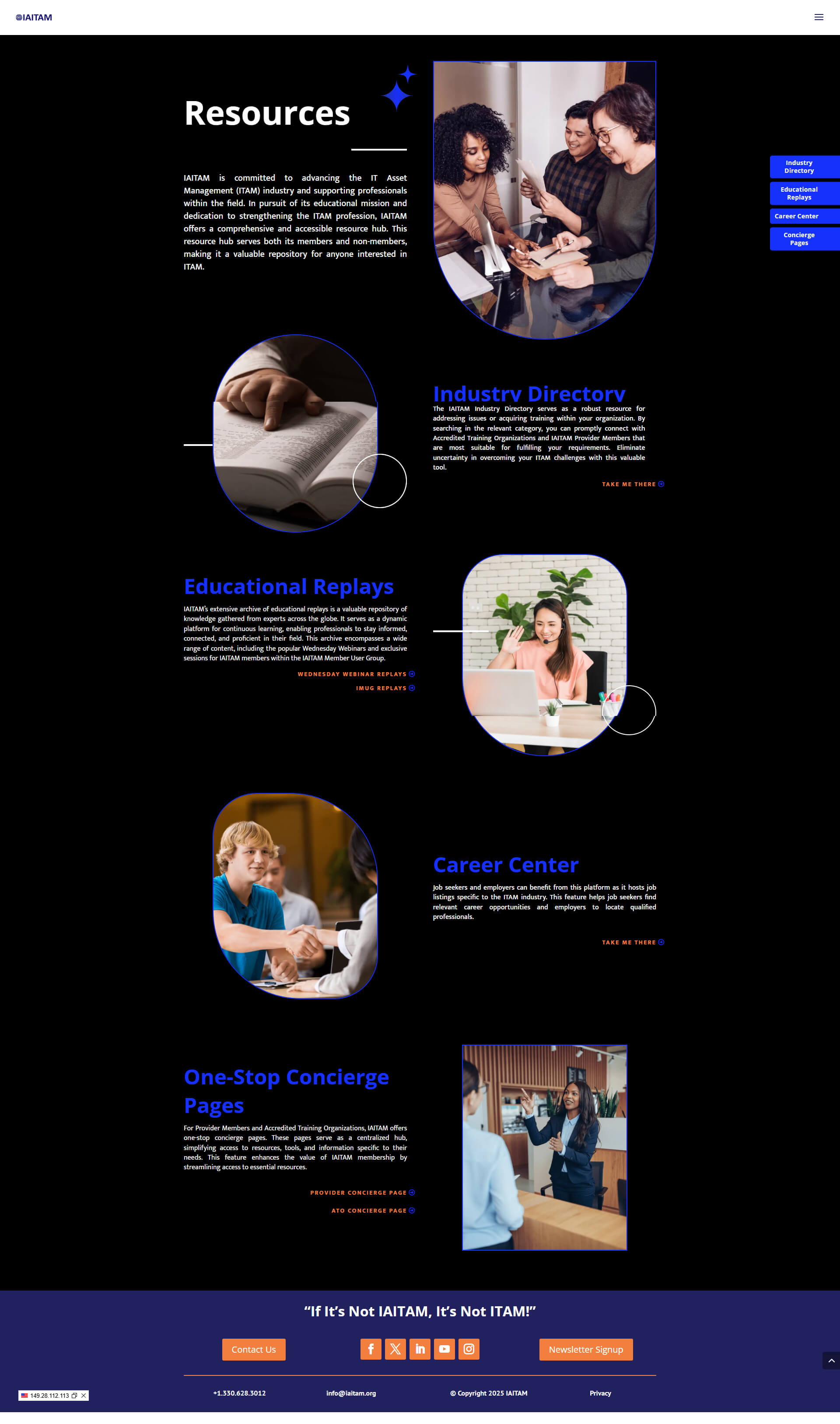
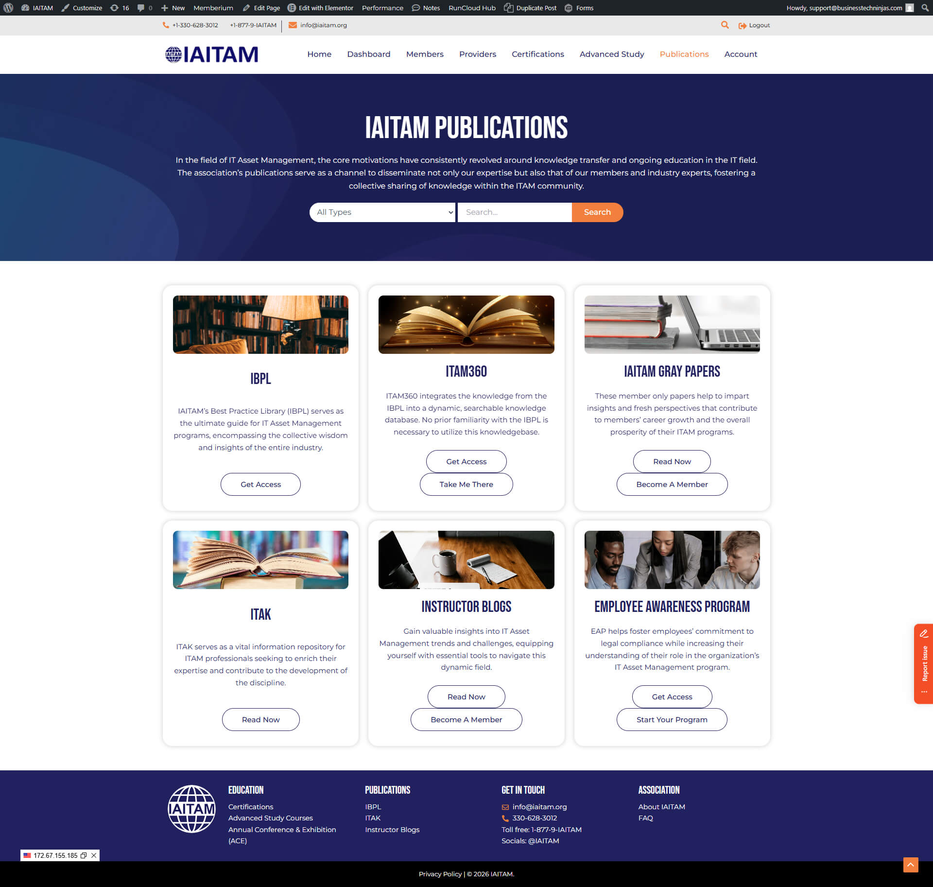
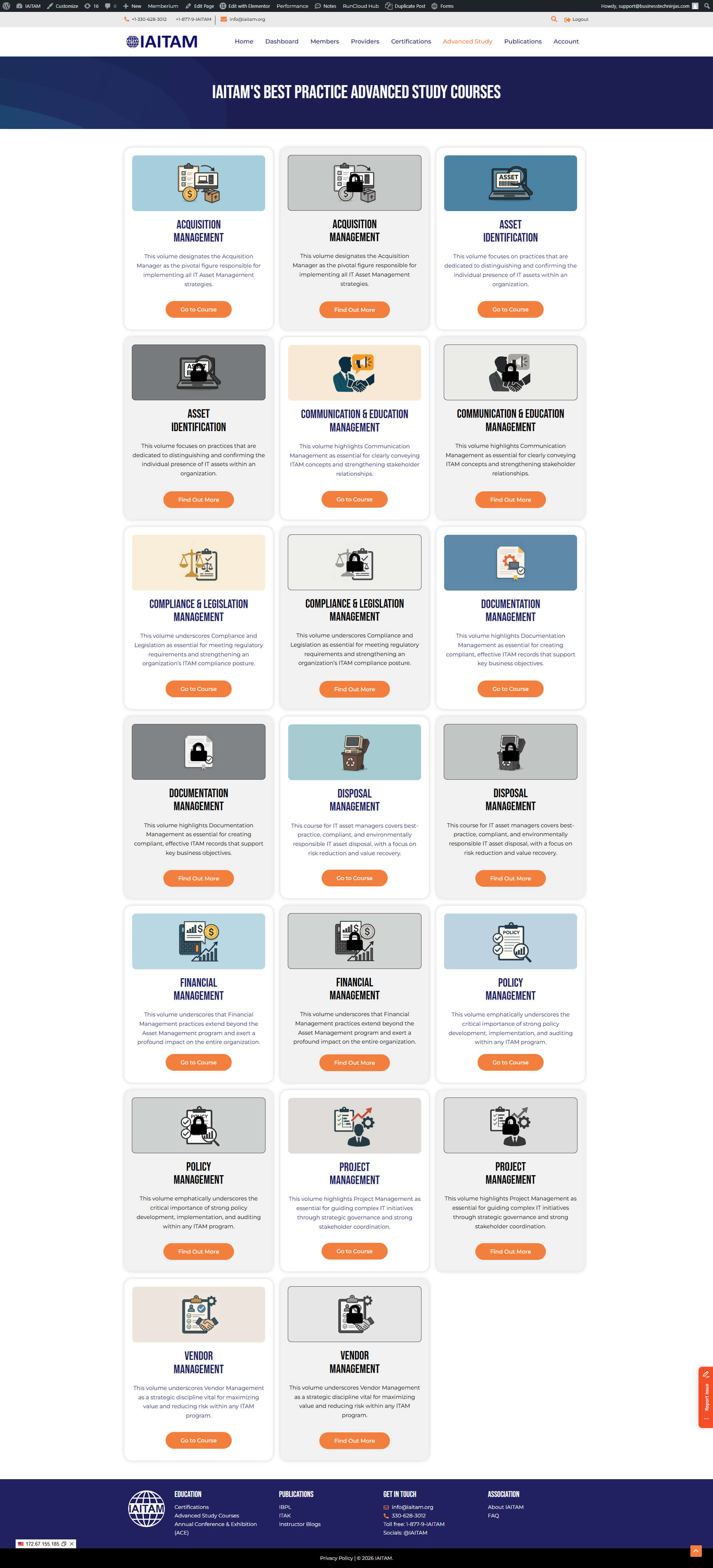
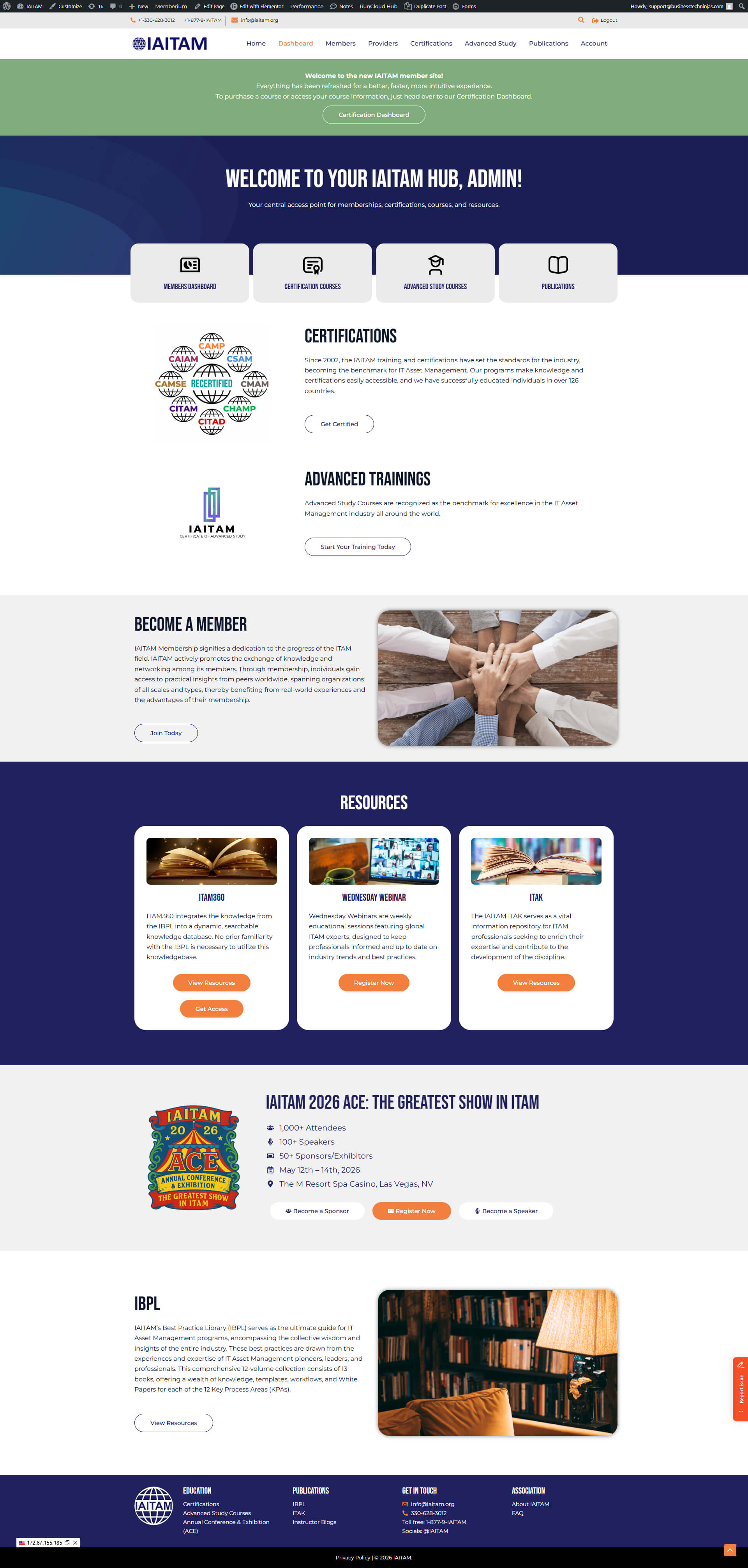
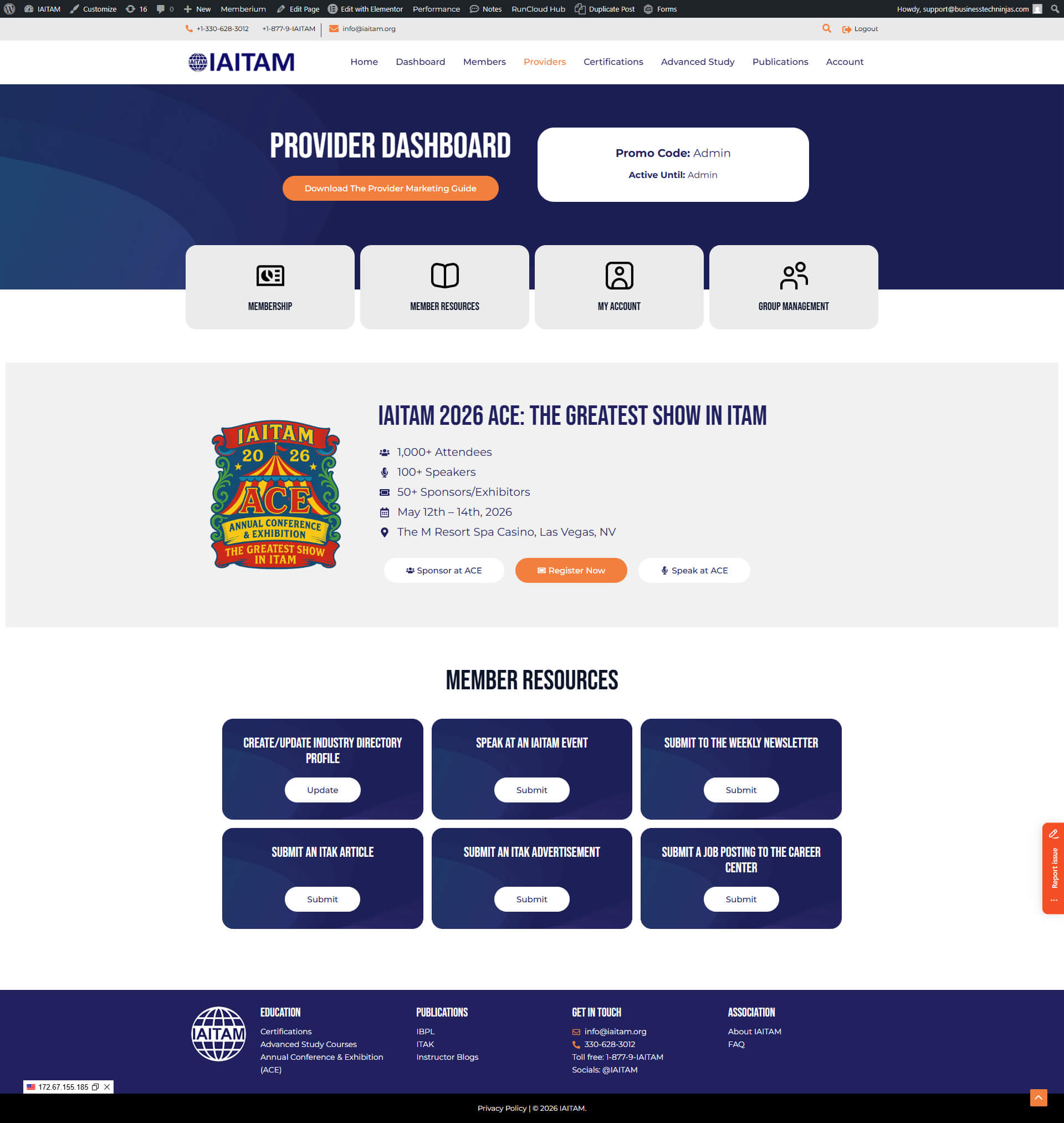
Membership experience for accessing programs
By separating the membership site, we created a clearer post-purchase journey where members can quickly find programs, understand what they have access to, and move forward confidently.
Certifications page inside the membership site
Certifications are a core IAITAM value driver. We created a dedicated certifications experience inside the member environment to reduce confusion, improve navigation, and help members take action faster.